Although we're remote first, I've always cherished our office days. On the days I made it in, we had a tiny space at CENTRL Office, the coworking spot we'd downsized to after the pandemic, with several desks, a couch, and some snacks. I'd run into colleagues I hadn't seen in a while, chat over coffee on a break, and leave with an idea I didn't walk in with.
Suman introduced me to artifacts during one of those office days. He was one of our engineers who had mostly worked in Go on the backend, and he was making forays into the UI. Along with his PR, he sent over an artifact of what he built, so I could have an easier time reviewing it.
That was the first time I reviewed what someone built instead of reading a diff and imagining the screen. Since then, most of what I share is something you can click.
the plan didn't go away
In February I wrote about planning as leverage. The line I liked most from that post was about the RBAC work: when someone asks where we are, the answer is a link.
That still holds. I still plan agent work before any code gets written, and those plans still carry the constraints, the test strategy, and the order of operations. What changed over the summer is what sits behind the link, and who clicks it.
The link used to open a document. Now it mostly opens something you can use.
three steps closer to the thing that ships
I can trace this through one feature. Supertopics shipped to all of our customers in September 2026. It replaced the Affinities model with AI-suggested groupings of a customer's topics. Over a few months, the way I communicated its design moved three times, and each move got closer to the shipped thing.
written plans
The first version was prose. A plan described the Topics page: a table here, a summary there, an empty state when there's no data yet. Stakeholders read about the UI and built a picture of it in their heads.
The written plan left room for different interpretations, and seeing the UI closed that gap. With content cards, for example, showing the MediaCard component made it easier to explain why we couldn't reuse DashCard, the card we used for integrations. It also made the work easier to review.
artifacts built against the endpoint
From July through September, I built single-page HTML prototypes with Claude's artifacts and published them as shareable links. The rule I held myself to was that every value on the page had to come from a real API shape. No placeholder fields, no data model I wished we had.
An early-August prototype of the Topics page had a scenario switcher across the top. You could flip it between Live, Loading, a "not enriched" 400 error, and No clusters. You could set it to one, three, or twelve context layers (separate sets of topics, like the default NLP layer or one built on product tags), and toggle between full access and view-only. Below the prototype sat a field map that traced each value in the UI to a real model field, with an API log next to it.
The note at the top of that page said:
Nothing in the control is invented. Checked against the frontend code, the backend, and the live Context Layers page on a real account.
Checking against the live page is how one of the most useful findings showed up. The prototype said it plainly: "One layer is the common case, not an edge case." In prose, it's easy to design for twelve.
design canvases of the running page
In late September I moved to a design canvas in Claude Design, and the design itself changed shape. It stopped being a drawing of the page.
The Topics Page Tabs canvas, made the week we shipped, put two boards side by side, today and proposed. The note on the canvas read:
Both boards are screenshots of the real page running against [a real account], not mockups. The proposed one is the actual TabsList component from our shared component library wrapping the existing sections.
Because the boards were the real page, I could measure them. Today's page was 3,685 pixels tall with two tables in the DOM. The tabbed version was 1,849 pixels with one table, because the inactive tab unmounts. That unmount also removed a collision we'd had between the two tables over a shared URL parameter.
I wouldn't have caught that from a mockup. It only showed up because the proposal was made of the components that would ship.
The document-page redesign followed the Supertopics work. By then, I could move quickly from spotting something I wanted to improve to putting a proposal in front of peers. Sometimes I just wanted to show them an idea and hear, "Very cool!"
Not every canvas starts from a running page. When the page doesn't exist yet, the boards carry its states instead, including the empty and broken ones.
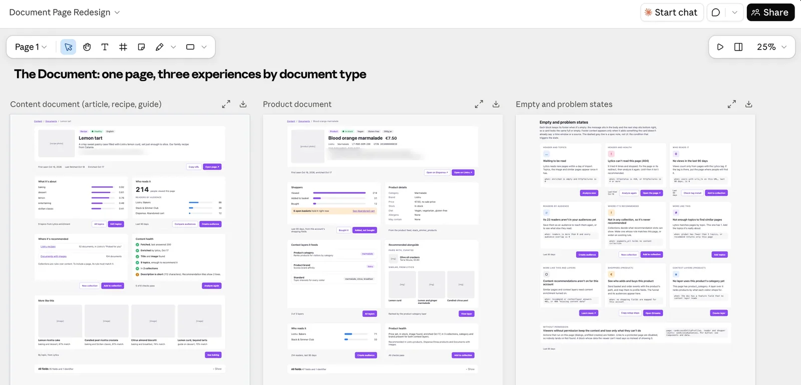
A proposed redesign on a design canvas: one page, three experiences by document type, and a board of every empty and problem state. The data is fictional, more on that below.
who reads them now
The audience for these turned out to be mostly other engineers.
At the end of July, a reviewer asked a question in a thread: "It looks like we make an API call to generate a bunch of super topics at one time?" I answered it with a request-flow doc. The doc opened by quoting the question and replying, "Half right." Then it walked through what actually happens, call by call.
Nobody planned that doc. It existed because an engineer asked a sharp question and a page could answer it faster than a thread could. On my team that's how it works now. Engineers send each other artifacts the way Suman sent me his, and the review happens on something clickable.
The stakeholders changed too, though artifacts aren't why. Our codebase has mature UX patterns, and most screen-level calls come down to using one, or cleaning a page up to match them. Engineers can make those calls, and our designer and PMs have handed more of them over. Artifacts only change how the call gets shown.
Our designer spends more time on product strategy, and the PMs I work with have been spending the time that frees up with customers. I don't have numbers for this. It's what I've watched happen over a few months on one team.
the artifact carries its own trail
The decisions still have to survive the trip from artifact to ticket to code. Here, the prototype took over the jobs the plan doc used to do.
The scenario switcher is the states spec. Every state a ticket needs to cover is a button you can press. The field map is the API contract, written next to the UI it feeds. The question and decision log at the bottom of each page is the decision record.
The Supertopic Summary prototype from mid-August shows how small those decisions can be, and how much they matter later. One decision it recorded:
The name is the customer's; the slug is ours.
That line settles a question that could otherwise come back in code review or a support ticket. And it sits next to the UI it governs.
Not every question gets settled in the artifact, and the open ones are labeled. The naming doc from late August ended with an open decision section: three options, a recommendation, and the reasoning for each. Anyone reading it could see what was decided and what was still on the table.
There's a real worry with prototypes like these. A polished page looks like a promise. Stakeholders see it and assume it's coming exactly as drawn. Designing against the endpoint is my answer to that. Mapping every displayed field to the API keeps me from designing around data we don't have. The unsettled parts are marked as unsettled, in writing, on the same page.
data that looks like a customer's
Screenshots of a real account are honest, and they can't leave the building. So I've started building a fictional company in our staging environment: Stack & Simmer Foods, with two family houses, Liotru for citrus and Terra Nivura for olives, and a shared shop called The Pantry. It's a demo shop where nothing is charged or shipped, but every search, basket add and demo order sends the same events a real store would. The profiles, audiences and recommendations behind it fill up the way a customer's do.
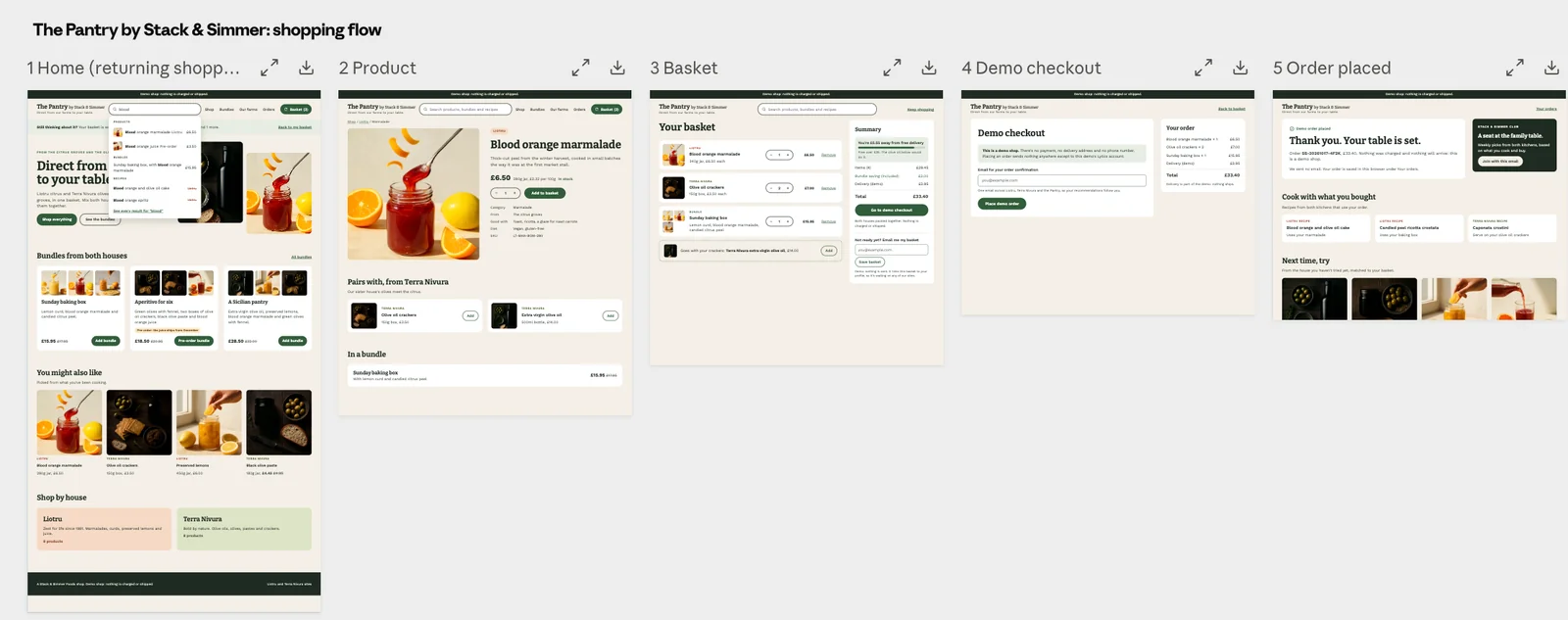
The Pantry's shopping flow on a design canvas, from home page to order placed. Every brand, product and price is made up, and the product photos were generated with gpt-image-1-mini at low quality.
The goal is designs and demos that show real customer problems, and that I can share freely without blurring anything out. This post is the first place I've been able to show one. It's early. I'll know it worked when a prototype built on it shows me something I would have missed, like the one-layer case.
from artifact to ticket
These days I start in Claude Design and work on the canvas until I'm happy with the design. Then I turn it into an interactive HTML artifact and share it with my manager or other stakeholders. I incorporate their feedback there. Once I get the "looks good," I break the work into Jira tickets.
The ticket links the artifact. The prototype's states become the acceptance criteria: if the switcher has a "not enriched" state, the ticket has a criterion for it. Questions decided in the artifact carry over as decisions. Open questions carry over labeled as open, so nobody builds against a guess.
The same HTML helps on the other side of the work. When I attach it to a plan for an agent, I have something concrete to check the agent's output with. I can put the result next to the page it was supposed to become.
what it costs
Polished canvases feel more decided than they are. Side-by-side screenshots of a real page carry an authority a sketch never had, so the word "proposed" on the board has to do real work.
When engineers make more of the screen-level calls, someone has to check them. Right now that's other engineers reviewing each other's artifacts, with our UX patterns as the yardstick. It works on a small team where everyone knows the product and the patterns. I don't know yet how it holds up with more people.
Some things a prototype can't tell you. The naming doc said it directly: "Name quality is not testable before deploy." A prototype against real API shapes shows you what the feature looks like. It doesn't show you how the feature behaves across everyone's data. For that, I had to go look at production.
Rollout plans don't get easier either. Ours, written a week before GA, said "Both dates are derived, not chosen," and then, a few lines later, "The cleanup slips. Design for it." The rollout still needs a plan for dates, dependencies, and cleanup.
And the files get big. A single self-contained page with a scenario switcher, a field map, an API log, and a decision record is a lot of HTML. They're easy to share and harder to maintain, and I haven't found a good answer for that yet.
Once the ticket exists, it goes one of two ways depending on the feature: through a gated agent pipeline, or it gets vibe coded. That's the next post.
This post went through the same loop it describes: I talked it through, Claude drafted from my notes and artifacts, and I edited by hand until it read like me.