Portland spring had been gorgeous all week. Genuinely unbearable-to-be-inside gorgeous. Blue skies, that particular light that makes you feel guilty for being at a desk. So I touched grass. Plenty of it. And I was so grateful when Sunday rolled in gray and soggy.
There was something tugging at me. The image generation sessions from earlier in the week had lit a fuse. The bake-off left me with a head full of questions and a price sheet memorized. The curiosity had been sitting there all week, waiting. A dreary Sunday was all the permission it needed.
gpt-image-1-mini at half a cent per image. I have a trip coming up, and I'd been wondering whether I could design myself a beautiful itinerary, considered, not printed off a booking site, while also probing what current image generation is actually capable of. As a UX-focused engineer, I'm drawn to that intersection: the aesthetic question and the capability question at the same time. I did the math with my finger on the trackpad. If I was careful, I could generate a complete visual direction (every asset type, eight different styles) for less than the cost of a single espresso.
So I finally gave in to the curiosity. Two hours later I had 154 images in a folder, a running total under a dollar, and a phrase I couldn't shake. Not can I? But should I?
the engineer's question
The question I started with was simple. Can you design a bespoke travel itinerary for under a dollar?
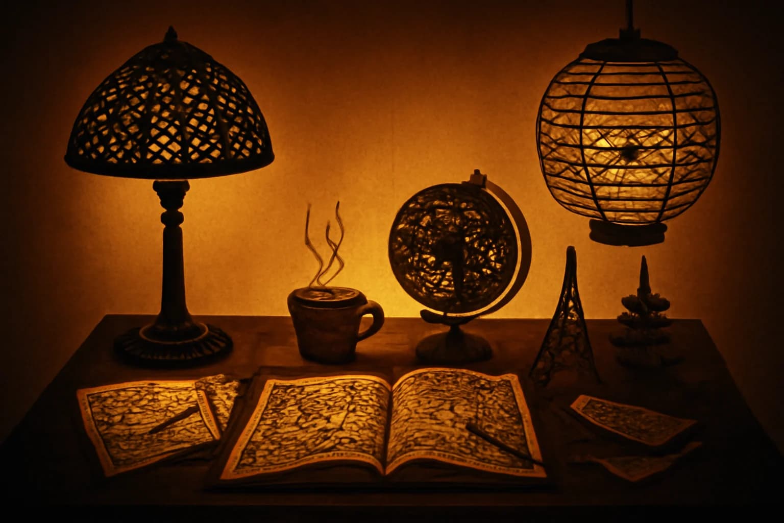
I like questions with numbers in them. They're honest about their scope. They either have an answer or they don't, and you can tell pretty quickly which one you're dealing with. I sketched out what "complete" meant: seven asset types a well-designed itinerary would need (hero image, destination cards, feature illustrations, social cards, a logo mark, a loading state, a blog header), eight visual directions to compare, all using the same scene anchor. Fifty-six base prompts, plus a small matrix of methodology tests. 154 images total, budget of one dollar.
The full run, every image, every style, is live in the visual experiment. You can dig deeper there.
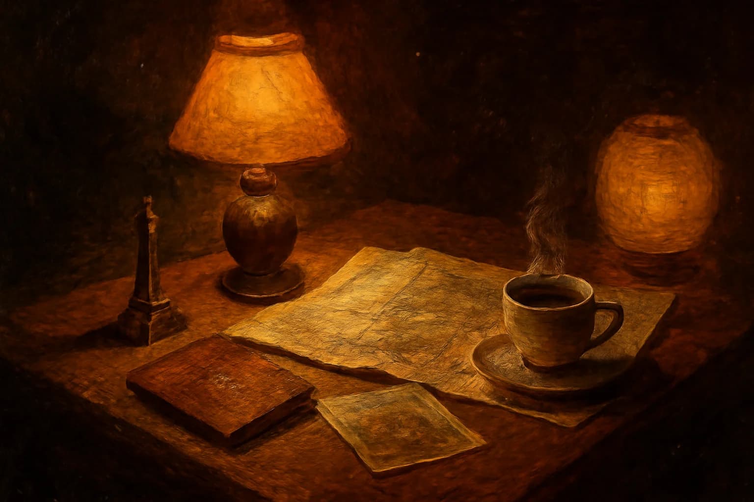
The answer is yes, and the engineer in me wants to stop here. Budget held. Images shipped. Visual direction picked (Moody Editorial, if you're curious: dark espresso backgrounds, warm lamp light falling on hand-drawn objects, like a travel journal folded into a coat pocket). Done.
But the experiment answered a question I hadn't asked, and that's the part I want to understand.
what I learned about the craft
Before I get to the part that surprised me, I want to name the prompt technique that made the experiment work. Four moves made the difference.
style deconstruction, not style naming
The first instinct is to name the style. "In the style of Studio Ghibli." "Like a Wes Anderson frame." The model will try, and sometimes it'll get close, and sometimes it'll hand you back something that looks like a Getty Images approximation of what those words mean on average. More importantly, naming a style borrows from a specific body of work, which is its own problem I'll come back to.
What worked better was describing the material process underneath the style. Skip "watercolor painting" and go straight to how a watercolor actually gets made: pigment diluted with water, bleeding at the edges, pooling where the paper buckles, soft gradient washes, visible paper texture showing through the lighter areas. The model doesn't need the label. It needs the mechanics.
Same thing for Moody Editorial. I wasn't asking for "a moody editorial photograph." I was describing what moody editorial photography is, at the level of the craft: low-key exposure, warm tungsten sources falling on matte surfaces, deep shadow that still holds color information, a slight warm grade in the mids, film grain in the blacks. Describe the chemistry, not the vibe.
Subject: A small ceramic cup of espresso on a worn wooden desk,
steam rising, a folded paper map beside it.
Intended use: Landing page hero image.

Medium: Hand-ground pigment suspended in egg tempera, applied
in thin translucent layers over a gessoed wood panel. Pigment
builds depth through glazing rather than opacity. Edges soften
where layers blend wet-on-wet. Visible brush texture in the
darker passages. Panel grain reads through the lighter washes.
No style name anywhere. And yet every output reads unmistakably as egg tempera. The model knows what the medium does without you having to tell it whose name is attached to it.


the scene is the medium
This is the one I had to learn the hard way. My first attempts at "egg tempera brand illustration" gave me a photograph of a desk with a small tempera painting on the desk. The model was interpreting the style as an object placed inside a realistic scene. Technically correct, conceptually wrong.
The fix was to stop putting the style into the scene and start letting the entire scene be rendered as the medium. The desk itself, in its entirety, rendered as egg tempera. (The phrase "a tempera painting of a desk" implies the painting is an object inside the scene, which is exactly the trap.) The whole frame is the surface of the panel. The espresso cup is pigment. The map is paper-over-gesso. Nothing in the image is a photograph of anything. Everything in the image is paint.
Once I rewrote the prompts to make that explicit, with language like "the entire scene is rendered as" and "the whole frame is constructed from," the outputs jumped a tier. Watercolor became actual watercolor, with its bleeds reaching all the way to the frame edge. Oil became actual oil, with impasto ridges on the rim of the cup. The style wasn't a layer on top of a scene anymore. It was the scene.
I kept thinking about this as the craft version of something I've always believed about architecture: the cleanest systems are the ones where the abstraction doesn't sit on top of the domain, it is the domain. Same instinct, different surface.
a mini study in composition
These three also changed the outputs in noticeable ways.
Structured sections change behavior even when the words don't. Same descriptors, different scaffolding, different results. The version that held most consistently used labeled blocks, one block per concern. The interesting part is that the labels changed the output even when they added no real information the model couldn't already infer from context. The structure itself seemed to matter.
When I showed the first gallery to my friend Mark, he sent me a Medium piece on SALT. This isn't a new idea if you work close to prompt engineering. But seeing it show up so clearly in my own runs changed my defaults. Across fifty-six paired outputs, the labeled version was more consistent. But consistency isn't always the point. In some cases, the unlabeled prompts produced stronger individual images because they gave the model more room to lean into its own biases and make bolder choices.
Intended use calibrates composition. Adding "Intended use: Landing page hero image" to the subject line was the single smallest change with the largest compositional effect. Without it, the model centered and cropped tight. With it, the model started leaving negative space to one side, softening focal weight so it wouldn't fight a headline. "For a landing page hero" isn't a visual description. It's a functional one. The model used it anyway, which told me the training data includes a lot of images made for purposes, and the model has a sense of those purposes.
Let the style own its lighting. My scene anchor originally specified tungsten light from upper left. That produced contradictions when the style was Watercolor, where the whole point of the medium is flat wash and paper luminance. The outputs came back with forced shadows painted on top of a flatter underlying composition, because they were. I stripped lighting out of the anchor entirely and let each medium description own its own light. Watercolor's light is paper showing through pigment. Oil's light is reflection off wet varnish. Moody Editorial's is tungsten. Once I stopped fighting the medium, the contradictions went away.
what the numbers showed
I ran the same scene anchor through all eight styles, seven times each, and logged brightness, color temperature, and generation time on every output. A few things popped out.
The scene anchor worked on color temperature. All 55 outputs from the main matrix landed in the warm range, every one of them, across all eight styles. Whatever I was doing in the shared subject language was robust enough that even Watercolor, which could easily have drifted cool with all that blue pigment in the world, came back warm. I did not expect that level of consistency.
Moody Editorial was 3.6x darker than Watercolor, measured as average pixel brightness. Editorial came in around 23.5, Watercolor around 84.7. Those aren't hand-wavy numbers. That's the gap between "you can barely see the shadows" and "the shadows are the image." It matters for downstream use: Watercolor assets won't survive on a dark background, and Editorial assets disappear on a light one. If you pick a visual direction, that direction narrows the surfaces it can live on.
Art styles were 3.6x more sensitive to structural prompt changes than editorial moods. When I A/B'd the labeled-section format against the unlabeled format, Watercolor and Oil Painting and Lacquerware shifted noticeably. Moody Editorial and Warm Film barely moved. My read is that "editorial photo" is a massively over-represented category in the training data, so the model has strong priors there and is harder to move with prompt structure. Art styles with more specialized training distributions were more malleable. Which cuts both ways, as I'll get to.
Oil Painting was the fastest style on average, 11.4 seconds per image. I don't know why and I don't trust myself to speculate. It just was.
And the moderation layer is nondeterministic. "Maps and coffee on a desk" got flagged as sexual content on the first attempt and passed cleanly on the second with the same prompt. I ran it three more times to be sure. Two passes, one flag. If you're building a production pipeline on top of this, you need retry logic for moderation, because the moderation itself is a dice roll on the edges.
what the medium carried
Everything up to this point is the engineer's version of the story. Budget, method, numbers, results. It's the clean writeup. It's also not where I ended up.
Somewhere in the middle of the run, with all eight style matrices spitting out espresso cups and folded maps, I got curious about something adjacent.
I'm Khmer. My family's from Cambodia.
The deconstruction technique I was using, describing a medium by its material process instead of its name, felt like it could reach toward traditions I grew up around but had never seen rendered by a model like this. So I made a small side gallery. Four Khmer traditions. Same scene anchor.
- Angkor stone relief. The bas-relief panels at Angkor Wat and the Bayon. I described it by the process: sandstone carved in shallow relief, figures overlapping in narrative registers, the carving depth shallow enough that the light across the surface becomes the contour, chisel marks preserved in the negative space.
- Khmer lacquerware. The gold-on-black tradition you'll see on temple doors and ceremonial objects. I described it by the chemistry: layered lacquer building a deep black ground, gold leaf applied in linework patterns, fine motifs drawn with a brush the width of a human hair.
- Sbek Thom, the shadow puppet tradition. Leather hide perforated with patterned holes, backlit against a white screen, the image existing only as a silhouette and the pattern of light passing through.
- Khmer silk. This one interested me for a different reason. It pushed the model's rendering capability most directly: thread, sheen, woven structure, patterned repetition, all the things that fall apart quickly when the model doesn't really have the medium.
Same scene anchor. Espresso cup, folded map, worn wooden desk. Intended use: hero image. Let each medium own its own light. Then I looked at the outputs and felt something cold move in my chest.
what the Khmer styles did
Every Moody Editorial output was a desk. Every Watercolor output was a desk. Every Oil Painting, every Lacquerware (Japanese, the same one from Part 1's Japan lineup), every Warm Film: desks, coffee, maps, atmosphere. Exactly what I asked for.
The Khmer outputs rendered cleanly too. The difference was in what the stone reliefs preferred.
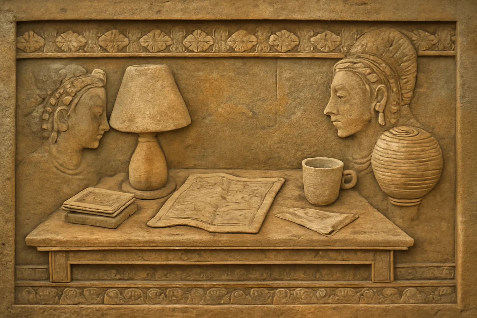
I didn't ask for people. The scene anchor was the same scene anchor. The subject line said a small ceramic cup of espresso on a worn wooden desk. What surprised me most was the Angkor stone relief output, which came back as a bas-relief panel with two people sitting across from each other, talking about their trip, with the cup, the map, and the desk still there.
Silk was interesting in a different way. It didn't force the same narrative turn. It pushed capability. Could the model hold woven texture, pattern density, and the particular sheen of silk without collapsing into something generic? That was its own kind of test.
The non-Khmer styles rendered the scene. The stone reliefs rendered a story with people in it and then placed my scene inside. A cup of espresso on a desk, in the middle of something that was already happening before I arrived.
I sat with this for a long time. I got up and pulled a shot on my sister's old espresso machine. She upgraded to something fancier last year and I inherited the one she'd been using; it still makes very good espresso. The kitchen was cold and the cup was almost too hot to hold, which is a detail I wouldn't usually mention except that I was trying very hard to feel my way into what I was looking at.
Here's my read. If you visit Siem Reap, you rarely see temple bas-reliefs without people in them. That's part of the tradition's DNA. Angkor's stone carvings tell stories through figures and have for centuries. The medium was made to carry narrative across generations. So when I described the carving process closely enough, the model didn't just pick up the chisel marks. It picked up what those chisel marks are usually for.
And the model learned more than the surface. The chisel marks, yes, but also what the chisel marks are for. In the material it had seen, shallow sandstone relief does not just mean a texture. It means people telling a story. The visual vocabulary is so saturated with narrative that you cannot pull the mechanical descriptors out cleanly. They come with their purpose attached.
IP-neutral deconstruction strips the specific content. It does not strip the inheritance. The tradition rides in on the technique, whether you asked for it or not.
The medium carries cultural memory even in an AI model trained on photographs of that medium.
I don't know whether to find that beautiful or troubling. Both, probably. It's the first time in any of this work that I've felt the model reach back through me to grab something I wasn't steering for.
the other failure mode
There was a second finding I almost missed. The Angkor reliefs came back with characteristic carving, figures in plausible poses, narrative registers that actually read as narrative registers. The model has seen a lot of Angkor. It's one of the most photographed archaeological sites on Earth.
But I also tried, in the same gallery, to generate a less-documented Cambodian tradition: a specific kind of temple ceiling panel I remembered from visits as a kid. I couldn't make it behave. The outputs came back confident and coherent and wrong in a way I couldn't quite articulate. The wrongness wasn't in the rendering quality. It was that the model had filled in an absence with an average of adjacent visual traditions, serving me a confident composite of things that weren't quite this thing.
Two failure modes, opposite in shape. Where the training data is dense, the model inherits the tradition's DNA, including the parts you didn't ask for. Where the training data is sparse, the model confabulates smoothly, giving you something that looks right and isn't grounded in anything. Both are bias. One is the bias of what got recorded too thoroughly. The other is the bias of what got recorded not enough.
The distribution of training data reflects whose traditions have been extensively digitized and whose haven't. That is itself a cultural artifact, and it's in every generation you'll ever get from a model like this. The Japanese styles I used in Part 1 fall into the first category, and honestly, I didn't pause to think about that at the time. I was running a benchmark and I treated it like one.
But the fact that I didn't pause is the point. At half a cent an image, the friction that used to make you stop and consider what you're depicting disappears.
should I?
Cost wasn't just cost. Cost was friction, and friction was the thing that used to force the pause.
You used to have to find a designer, brief them, wait, pay them. Every step was a gate where you'd ask yourself should I be doing this. The gates weren't moral checkpoints. They were slow enough that the should-I question had time to arrive on its own.
I was trained in chemistry before I was trained in software, and both disciplines have a way of narrowing your attention to the hypothesis in front of you. Is the reaction going? Is the test passing? Did the protocol hold? The question is always can I. Can I get this to work. Can I hit the budget. Can I reproduce it. The should I was the part the process used to handle for you, quietly, in the waiting.
29 cents removes the gates. It removes the moment where you'd stop, because there isn't a moment anymore. You type, it generates, you scroll, you type again. The hypothesis loop runs at the speed of thought, and the should I question, which used to get a slot in that loop almost by accident, now has to be manually inserted or it doesn't get asked.
Along with chemistry, I also studied cultural anthropology at Macalester, and one of the things anthropology trains you to hold is that cultural practices aren't modular. You cannot cleanly separate the technique from the meaning. What looks like "just the method" to someone from outside a tradition is often fused with purpose, cosmology, relationship, authority. Deconstructing a craft by its material process feels like a neutral move. It isn't. The deconstruction itself is a cultural choice, made by the person doing it, about which parts are "just technique" and which parts are "the real thing." The tradition's community didn't get to weigh in on where that line sits. I drew it. I drew it from outside, even for my own heritage, because I was raised in one place and the tradition lives in another.
And the cleaner the deconstruction looks on the page, the more it hides that choice. A prompt that says "the entire frame is rendered as shallow sandstone relief with chisel marks preserved in the negative space" reads as a description of a method. It isn't. It's a decision that sandstone relief's narrative register is optional, that the storytelling purpose is severable from the carving technique. The model, when it generated figures anyway, was quietly telling me that decision wasn't supported by the material it had seen. The tradition pushed back through the output.
I'm not sure what I do with that. I don't think the move is to refuse the methodology. It's too useful. But the methodology doesn't solve the problem it looks like it solves. It makes the problem feel neutral, which might be worse than leaving it visible.
What I'm taking away is smaller than an answer. It's closer to a discipline: the should I question has to be scheduled back into the loop, because the friction that used to schedule it automatically is gone. Before the prompt, not once it's already generated. Once the image is sitting in the folder, it's too late, because it exists and you paid almost nothing for it and the effort required to throw it out is now greater than the effort required to have made it. The decision has to live upstream of the generation.
what I still don't know
I don't know if the SALT labels work because of training-data structure, or because of attention mechanics, or because I'm pattern-matching on fifty-six outputs and would see the pattern fall apart at a thousand. I also don't know if the Khmer figure effect holds across other traditions with strong figurative priors, or whether I happened to hit three that share a bias and I'm generalizing from a cluster. And I don't know whether the right way to work with these models, for cultural subjects, is a collaboration with practitioners of the tradition rather than a deconstruction from outside, and if so, what that collaboration looks like when the tool costs half a cent and the tradition took a thousand years.
I also don't know whether a third model, run against the same 154 prompts, would agree with any of this or disagree with all of it. I have a suspicion about that one. The machines don't always agree. I'll get to that soon.
The visual direction is done. It looks good. Moody Editorial won, in case you were wondering, and the espresso cup sitting on the hero image looks exactly like the espresso cup sitting next to my laptop right now, which is a small satisfying recursion I didn't plan for.
The cost was 87 cents. A US dollar, rounded up. The thinking was longer, and I'm still in the middle of it. Some questions don't resolve at the end of an experiment.
The live gallery for this experiment, every style and every asset, lives at image-lab.contentstackapps.com.