I've been hacking on a little side project to help me plan my next trip, and one thing it needs is image generation for the places on the itinerary. I already had Google Cloud infra set up, an OpenAI API key sitting around, and a budget that wanted to stay in the low single-digit cents per image.
The look I wanted was specific. Think warm lamp light. That particular dusk where the sky hasn't decided yet. Colors that sit well against an espresso background and pull you into the warmth. Editorial travel photography, with just a touch of nostalgia.
The first pass gave me an answer. The second pass made me back up.
At first, it felt pretty simple: the most expensive model wasn't the right tool for this job. Nano Banana Pro came in with the hype and a price tag six times what Imagen 4 standard was asking, and on the first pass the cheaper model looked just as good. For low-stakes surfaces like activity thumbnails, gpt-image-1-mini medium at a cent an image was surprisingly close to good enough.
Then I went back and checked whether the images were actually depicting the places I asked for, not just matching the mood. That changed the recommendation.
the setup
I kept it narrow on purpose. I wrote one style anchor and reused it everywhere. Same composition rules, same lighting direction, same no-text rule. Then I picked eight prompts that covered the real shape of travel content.
I also picked Japan on purpose. I'm going there in a few weeks, and the bake-off was half research, half anticipation. I wanted to know what the models understood about the places I was about to walk through.
The prompts:
- temple: Fushimi Inari Taisha at dusk, with the torii corridor
- street food: Dotonbori at night, canal-side, neon reflections
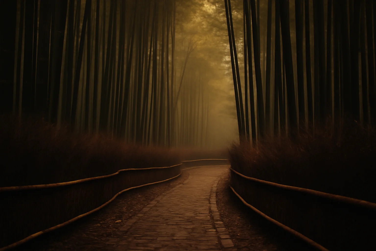
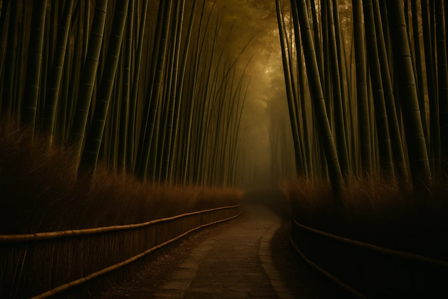
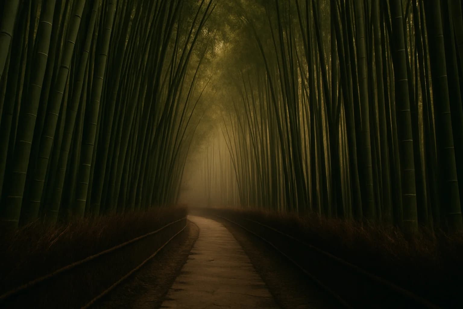
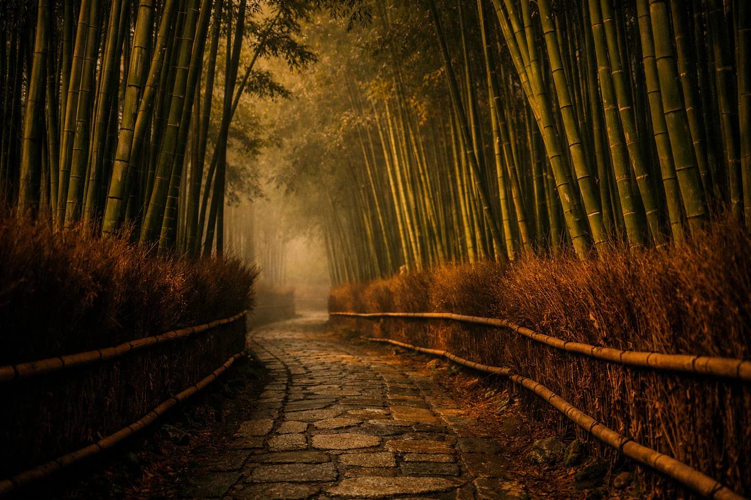
- nature: Arashiyama bamboo grove, golden hour light filtering through
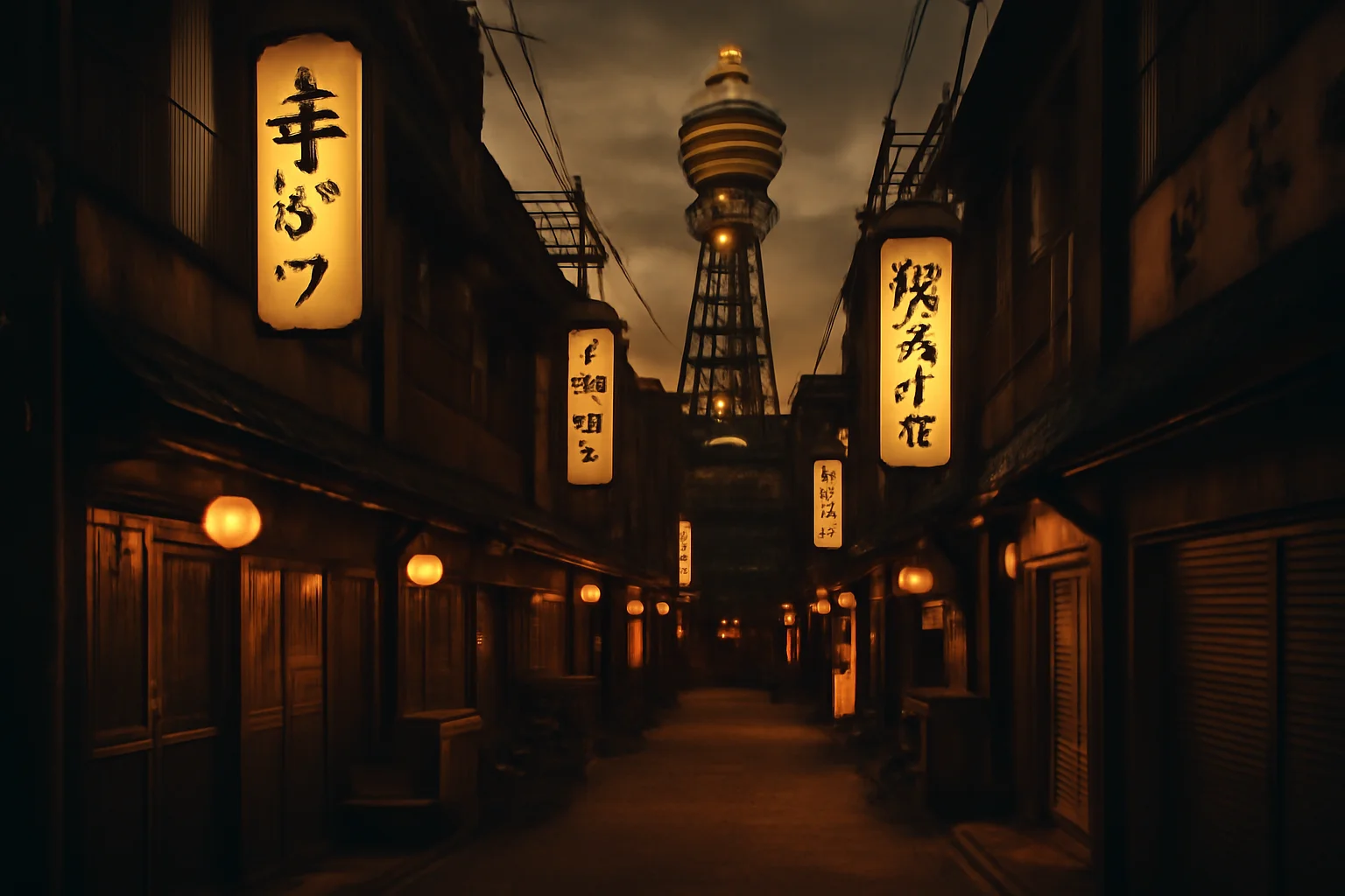
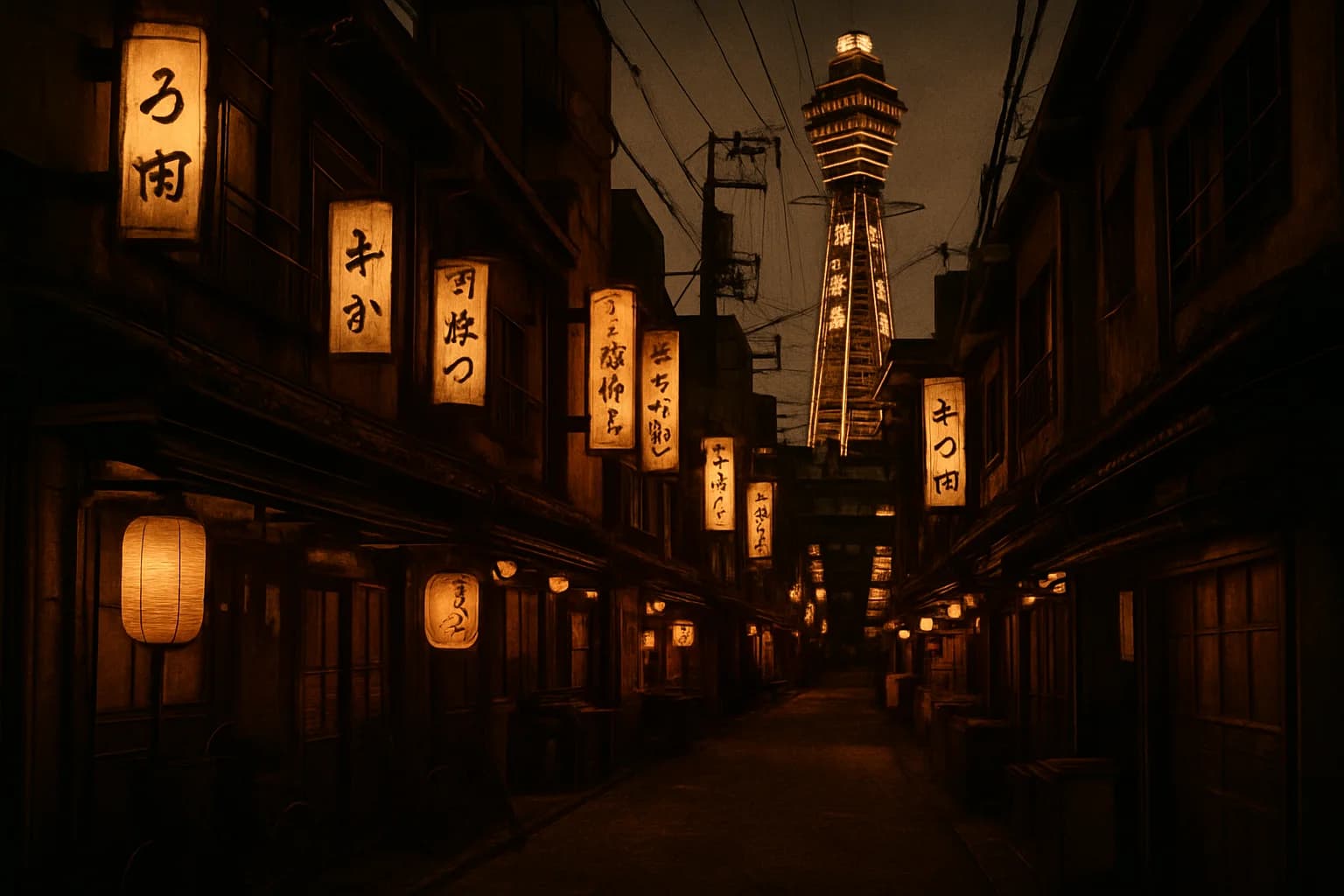
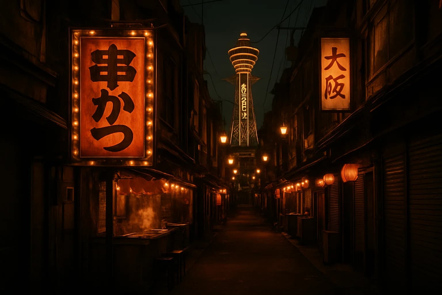
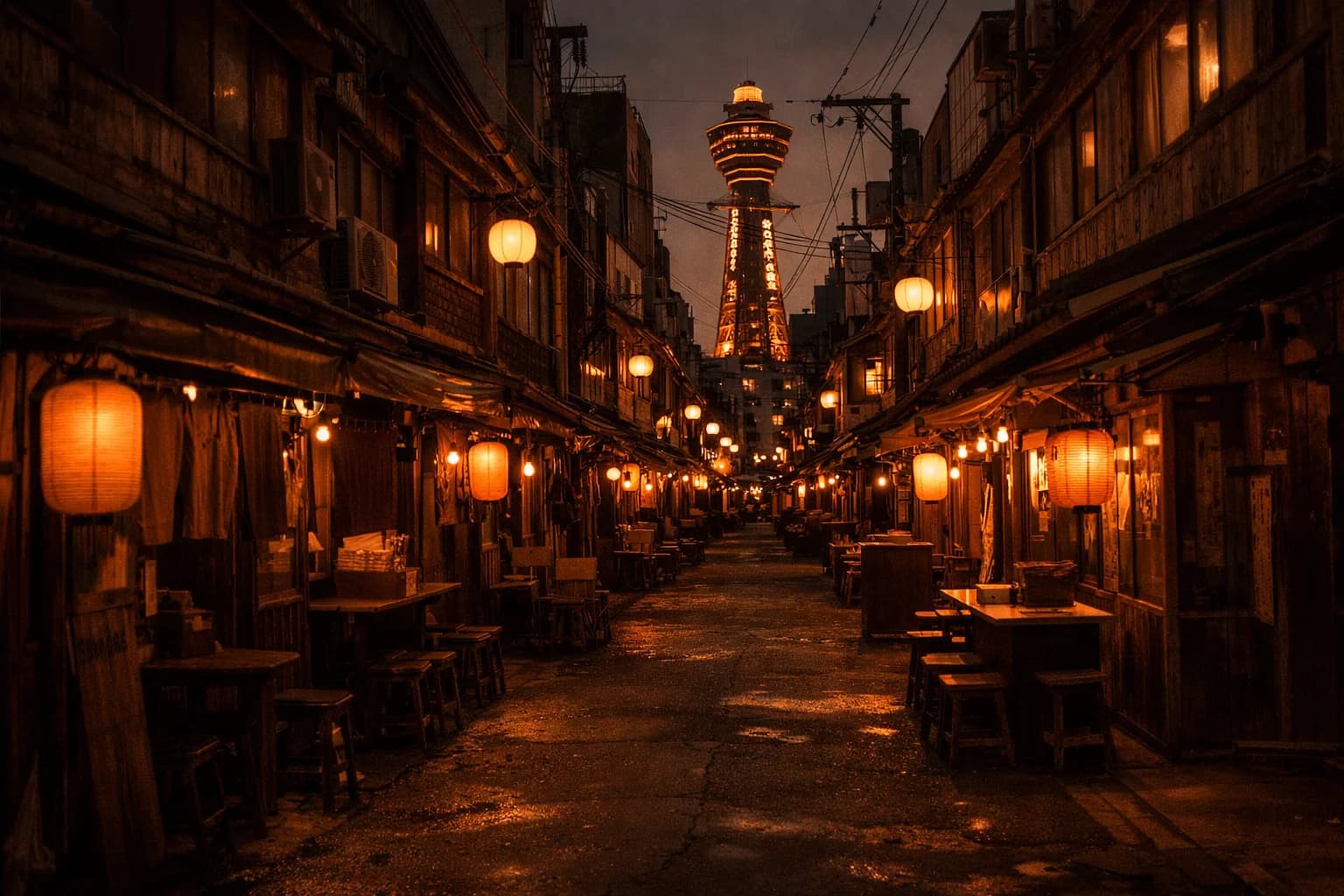
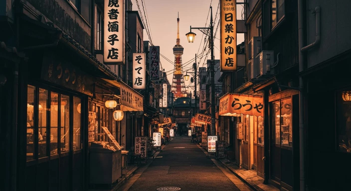
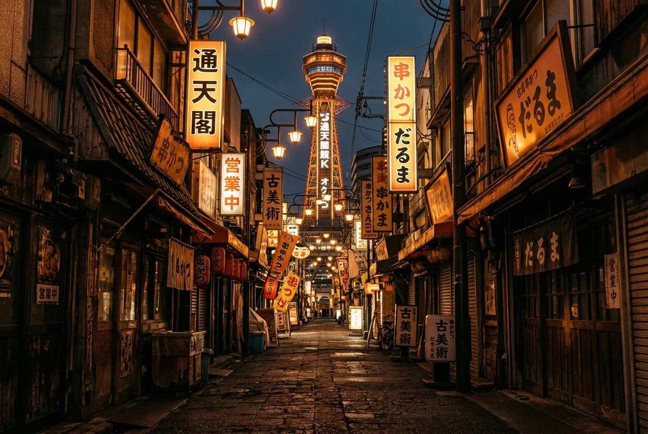
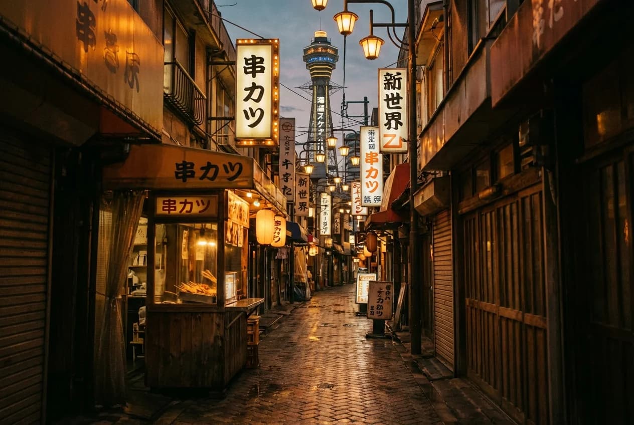
- urban: Shinsekai in Osaka, Tsutenkaku visible, lantern-lit alley
- beach: Jimbaran Bay, Bali, at sunset
- city header 1: Kyoto in spring, machiya houses, soft evening
- city header 2: Bangkok at golden hour, skyline over the river
- trip banner: a single wide composition blending Japan and Taiwan
Eight prompts, same anchor, one pass per model. That was the whole protocol. I wanted the comparison to be boring enough to be real.
the cost landscape
Before I ran anything, I listed every image model I could actually buy against that budget and what each one would cost per image. Prices below are as of April 2026 and worth re-checking if you use them; these numbers move often and quietly.
OpenAI
| Model | Variant | $/image | Status |
|---|---|---|---|
gpt-image-1 | low | $0.011 | tested |
gpt-image-1 | medium | ~$0.042 | tested |
gpt-image-1-mini | medium | $0.011 | tested |
gpt-image-1.5 | medium | $0.034 | tested, round 1 winner |
Source: OpenAI API pricing.
| Model | Variant | $/image | Status |
|---|---|---|---|
imagen-4.0-fast-generate-001 | Imagen 4 Fast | $0.02 | tested, low-cost tier default |
imagen-4.0-generate-001 | Imagen 4 standard | $0.04 | tested, quality tier default |
imagen-4.0-ultra-generate-001 | Imagen 4 Ultra | ~$0.06 | cut: marginal gain over standard |
gemini-2.5-flash-image | Nano Banana 1 | $0.0387 | already my production default, also primary failover |
gemini-3.1-flash-image-preview | Nano Banana 2 | $0.067 | tested |
gemini-3-pro-image-preview | Nano Banana Pro | $0.134–$0.24 | tested |
Source: Google AI pricing.
I looked at ten models, tested eight, and cut two before making a single API call. Imagen 4 Ultra on cost. Nano Banana 1 because it's already my production default and I know exactly what it delivers.
round 1: the openai family
I started with what I already knew. I ran gpt-image-1 at low and medium, gpt-image-1-mini at medium, and gpt-image-1.5 at medium. Thirty-two images, about 10 minutes, just enough time to make coffee. About eighty cents later, I came back to a grid that told a pretty clear story.
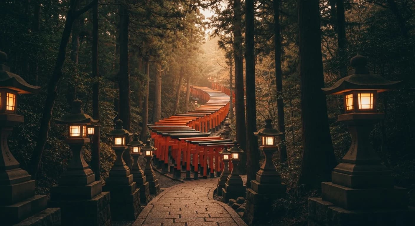
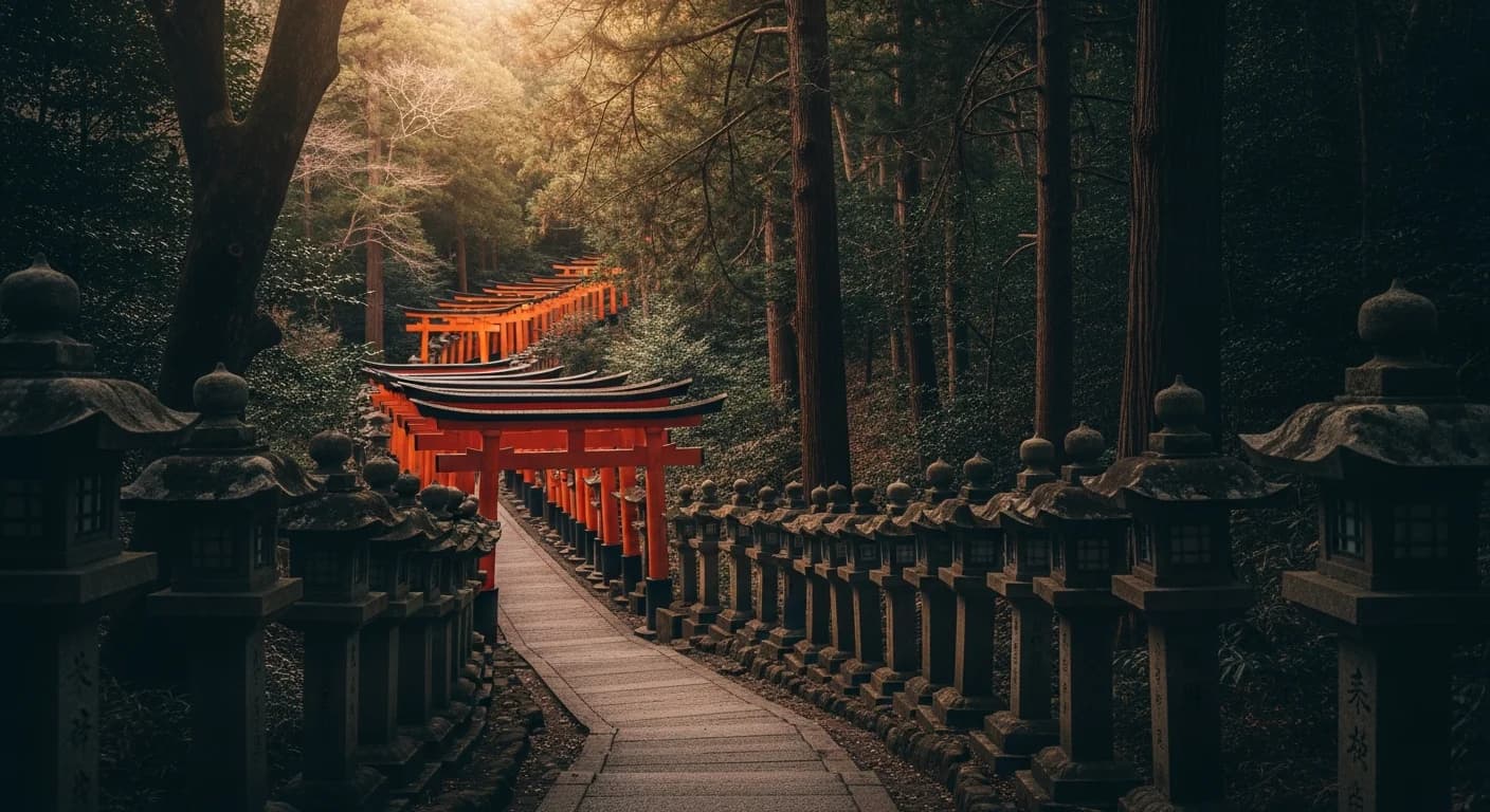
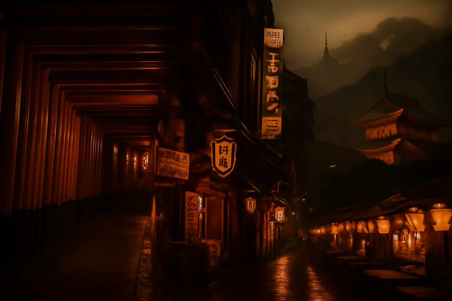
Before you look at this one, focus on the gates. Ignore the mood for a second and just ask whether it reads like Fushimi Inari.
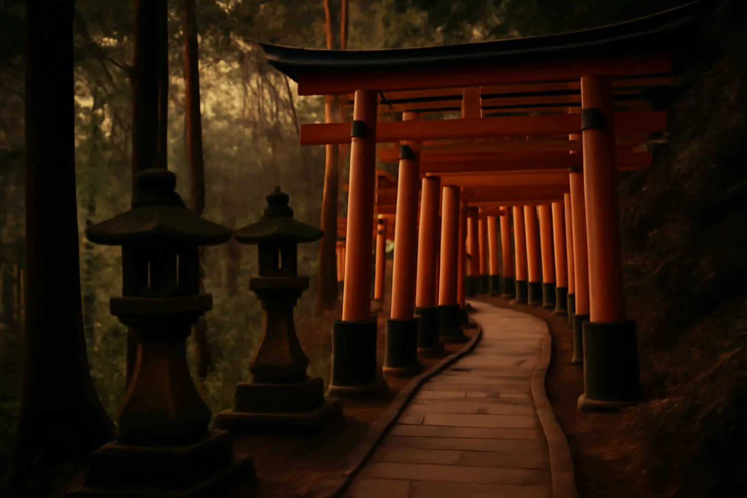
gpt-image-1.5 medium was the one I kept coming back to. Fushimi Inari actually looked like Fushimi Inari. The bamboo looked like bamboo. The banner came back as one image instead of a collage. It just kept doing the obvious things right.
gpt-image-1-mini medium was the dark horse. It was weirdly good for the price. A few images were close enough that I had to stop and check which model made them. But it would also randomly hand back something that felt like an old stock photo, and that was enough to keep me from trusting it as the default.
gpt-image-1 low got eliminated quickly. The nature prompts came back monochromatic and haunted-looking, which is a sentence I didn't expect to type. The bamboo grove in particular had this gray-wash quality that made it feel like a still from a horror movie's prologue. gpt-image-1 medium got eliminated too, for a quieter reason: it was a cent more than gpt-image-1.5 medium and did nothing better. No reason to keep it in the running.
So I walked out of round 1 with a tentative answer: gpt-image-1.5 medium, about three and a half cents an image, roughly twenty-two seconds per generation. I was ready to commit. The only reason I didn't was curiosity. Google had been quietly shipping a lot in the last six months, and I wanted to know what I was leaving on the table before I stopped looking.
round 2: the google lineup
The Google side had more SKUs than I expected. Two of them I eliminated before running a single prompt, because why I cut them matters here.
Imagen 4 Ultra was fifty percent more expensive than Imagen 4 standard for marginal gains. I'd only pull it in if standard came back clearly insufficient.
Nano Banana 1 (gemini-2.5-flash-image) I skipped deliberately. It's already my production default, and I know its capabilities cold. The bake-off was about finding out what else was out there, not re-validating what I already run.
That left four to actually test: Imagen 4 Fast, Imagen 4 standard, Nano Banana 2 (gemini-3.1-flash-image-preview), and Nano Banana Pro (gemini-3-pro-image-preview). Same eight prompts. Same style anchor. Same grid.
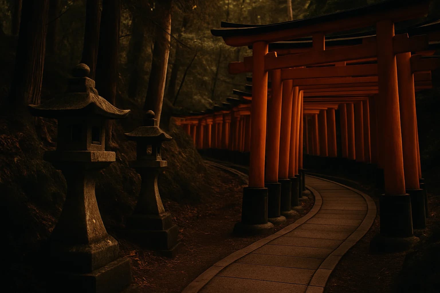
Same instruction here: look at the gates first, not the color.
the first read on round 2
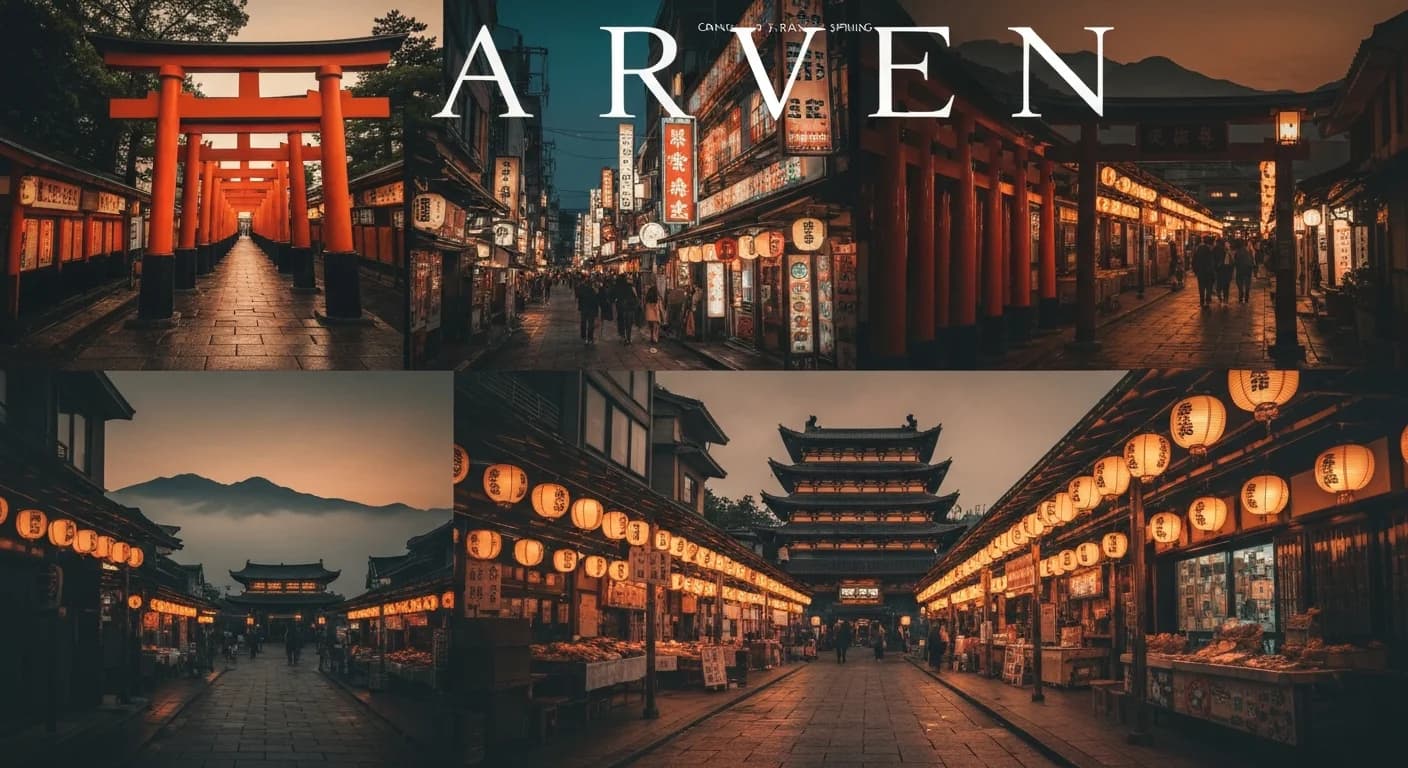
Imagen 4 Fast was the one that kept making me stop and stare. My initial notes, written before I knew what I was missing, said it won or tied seven of eight prompts. Two cents an image, half the price of everything else in the running. That's hard to beat. And honestly, the mood was spot on. I looked at the images for a bit and got excited enough that I called Mark and walked him through the grid. We were both surprised by what Imagen 4 Fast was delivering at that price point.
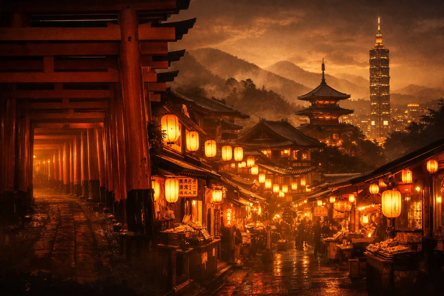
The one clear failure was the trip banner. Imagen 4 Fast handed back a four-panel collage with garbled text across the top spelling something like "ARVEN," which violated both the no-text rule and the single-composition rule in the anchor. Standard got that prompt right: a unified wide frame, cohesive color grading, no text artifacts. Same model family, better handling of the complex instruction.
The banner grids are simpler to read. Don't compare vibes first. Just ask: is this one image, or does it fall apart into pieces?
At that point I thought I had the answer. Use Fast for almost everything, and bump up to standard for the trip banner. Same family, same general look, lower cost. I was ready to call it.
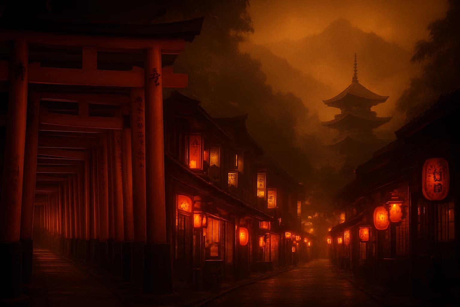
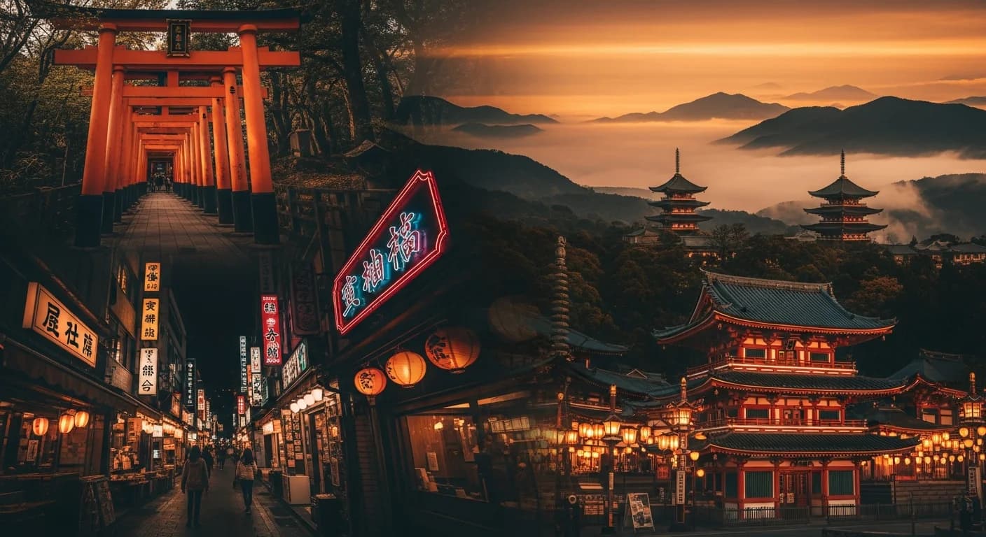
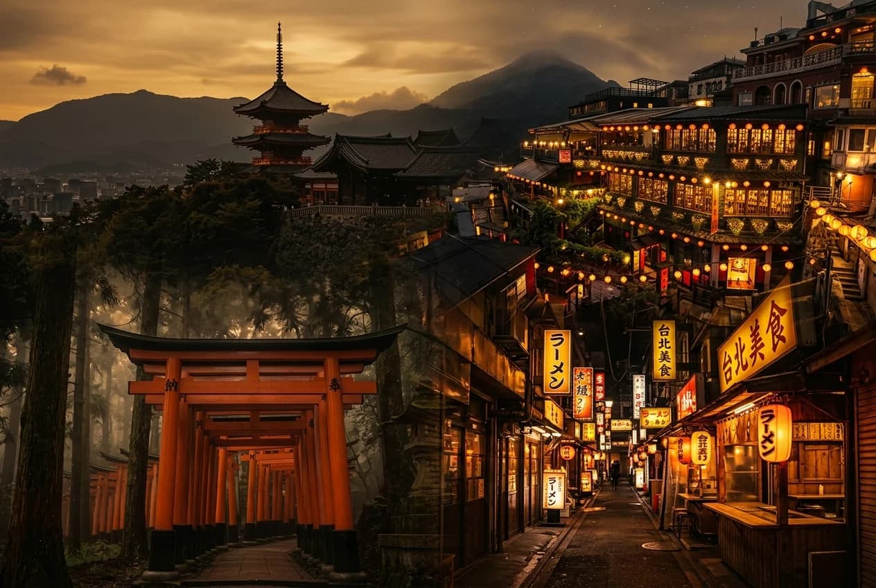
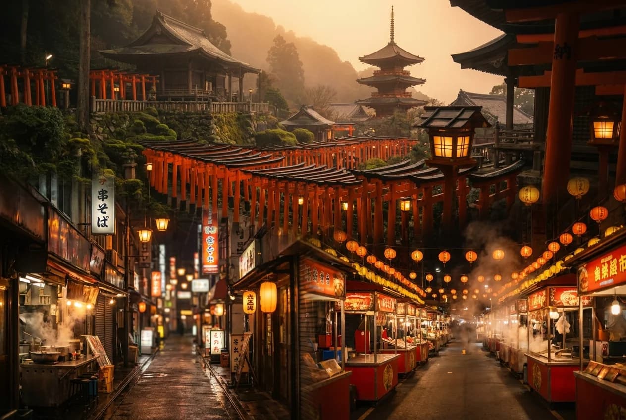
I ran every tested model across all eight prompts. The grids you'll see throughout this post cover four of those eight: Fushimi Inari, Arashiyama, Shinsekai, and the trip banner. Those were the ones where the differences jumped out. The other four also had their quirks, but the story was similar.
wait a minute
Before I committed, I asked a different question, almost in passing. These images look beautiful, but do they actually depict the specific places I asked for? Or just something that matches the mood?
I went back image by image. That's when the misses became obvious.
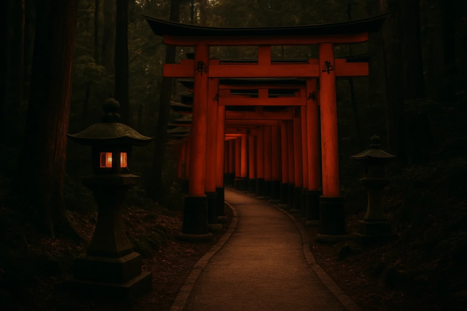
Fushimi Inari. Imagen 4 Fast had rendered the torii gates as a red zigzag fence lying along the path, like a painted wooden barrier. The defining element of Fushimi Inari is the gate-lined walkway itself: thousands of vermilion torii forming tunnels up Mt. Inari. Standing arches. A tunnel. My image had none of that. It had a red fence on a generic-looking path, with stone lanterns that looked cloned and mirrored. Beautiful, warm, editorial mood, wrong subject. Fine on a thumbnail. Shippable disaster on a banner.
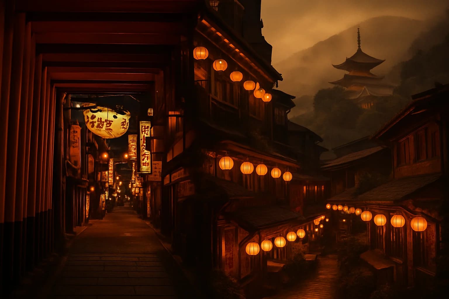
Tsutenkaku. Shinsekai's tower came back slender and tapered, which read to me as much closer to Tokyo Tower than to Tsutenkaku. Tsutenkaku is the defining landmark of Shinsekai, and in my read the Fast output missed that silhouette badly enough that the scene stopped reading as Shinsekai. Standard got closer. Nano Banana 2 got closest of the Google four. If you didn't know Osaka you'd scroll right past the failure. It had been over 10 years since my last visit, but I still had that shape in my head from the first time I was there.
For these grids, look past the alley and go straight to the tower shape in the back.
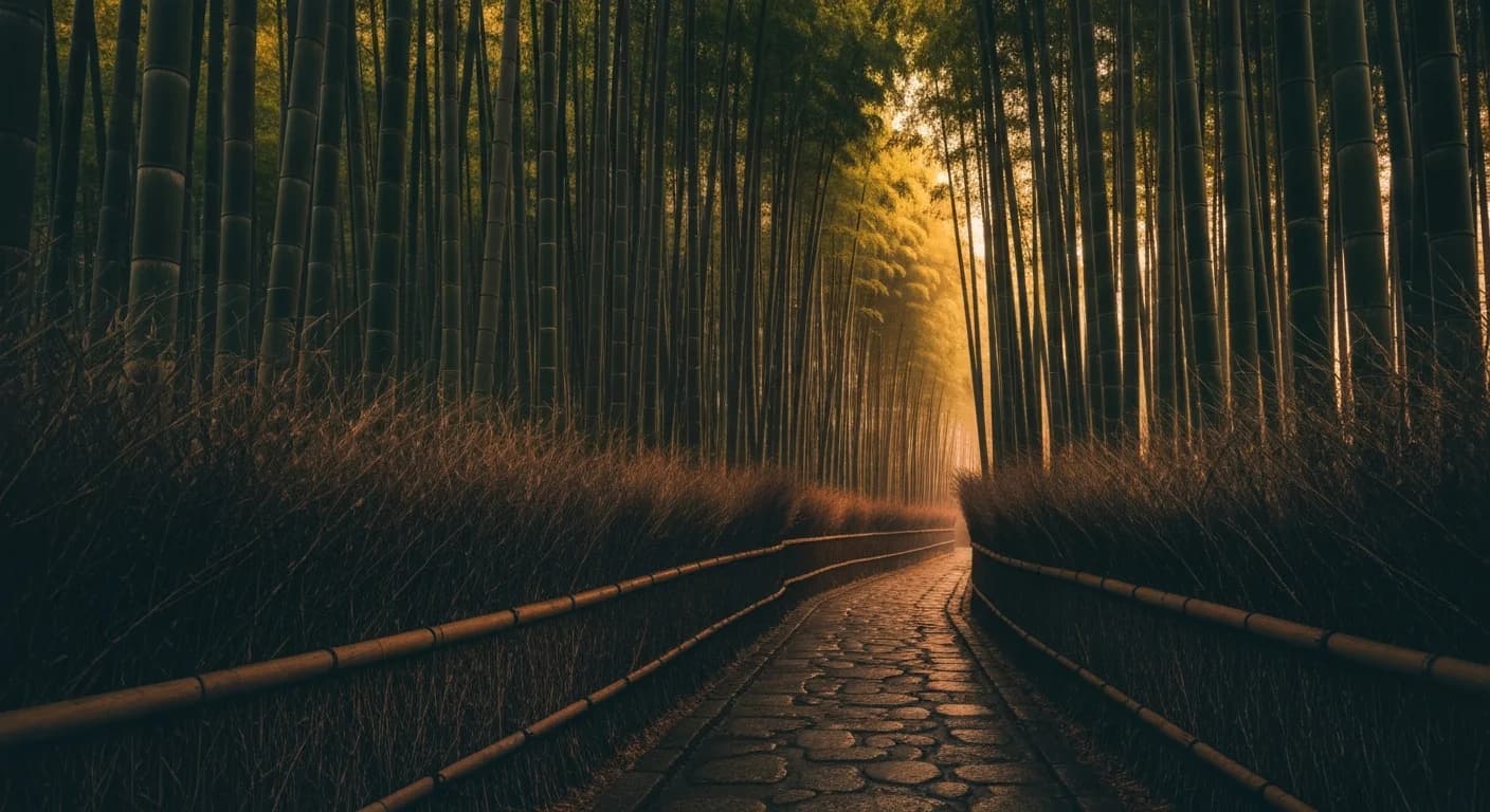
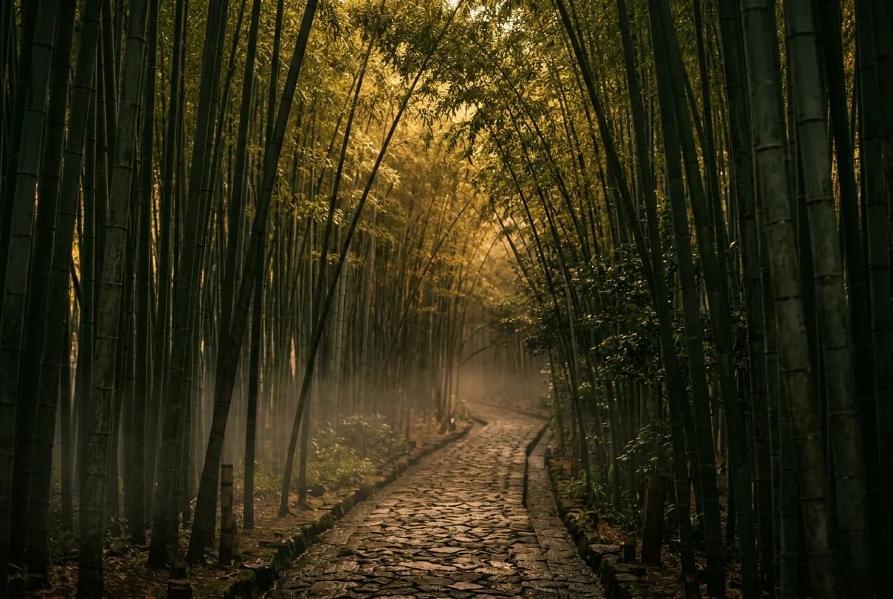
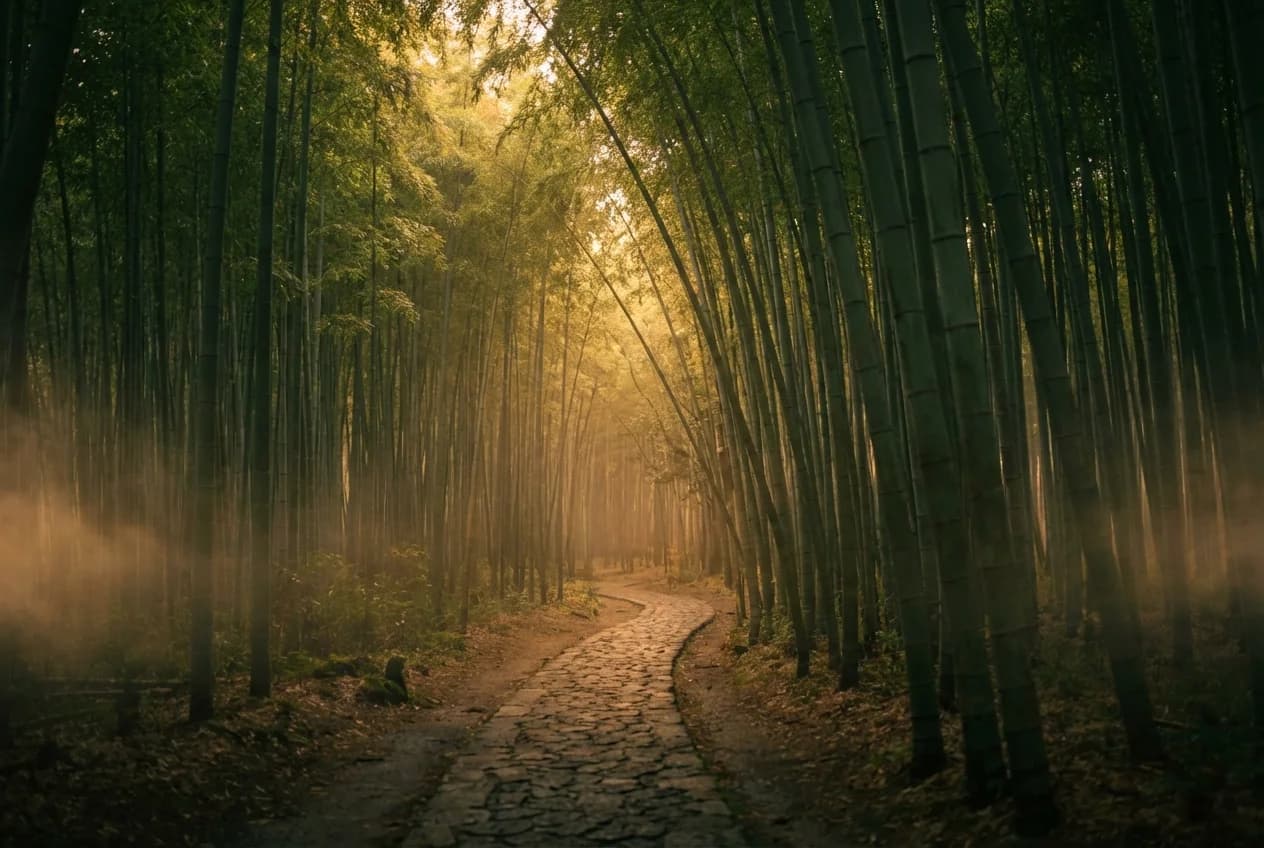
Arashiyama bamboo. Imagen 4 Fast pushed the whole grove into warm amber. Real bamboo stays green even under golden-hour light, and Fast cooked a lot of that out. Standard held the greens better. gpt-image-1.5 held them best. But look down the rest of any column and something else is off: every single model rendered the path as cobblestone, even though the main Arashiyama Bamboo Grove walkway is paved. Several also added bordering vegetation that didn't look right to me for the main tourist path. The amber problem felt tier-related. Pay more and it gets better. The path problem was different. Everybody missed it.
On this one, look at it twice: first the color of the bamboo, then the path.
The grid still looked great: warm, cohesive, editorially on-brand. But the subjects were wrong often enough that if I'd shipped on my first read, every Fushimi Inari reference I ever generated would have been wrong torii. Every Tsutenkaku would have had the wrong silhouette. Every Arashiyama would have had the wrong path material.
what the grid was hiding
The style anchor was basically fooling me. Not on purpose; anchors don't have intent. But functionally, it was painting a layer of editorial mood over every output, and that layer was strong enough to hijack my gut judgment. When I scanned the grid, I was grading each image on does this feel like a magazine cover, and the answer was almost always yes. I wasn't grading it on is this the place I asked for. Two completely different questions, and when the first one resolves positive with enough confidence, the second one stops getting asked.
The mood could be right while the place was still wrong. Those two things didn't move together here. A strong style prompt can drag a weak subject rendering right across the finish line of a gut-reaction scoring pass, because everything looks right. Nothing flags as wrong. You move on.
If I'd had a spreadsheet with two columns, mood score and subject-accuracy score, graded independently, the failure would have been obvious in round 2. I didn't. I had a grid and a gut, and the gut was tuned to the anchor. I had to stop asking "does this look good?" and ask "is this actually the place?" It's the same move I wrote about in planning as leverage.
I nearly shipped wrong torii on every banner that mattered. Not on every surface, the thumbnail version is honestly fine, but on the ones where someone could look closely enough to notice.
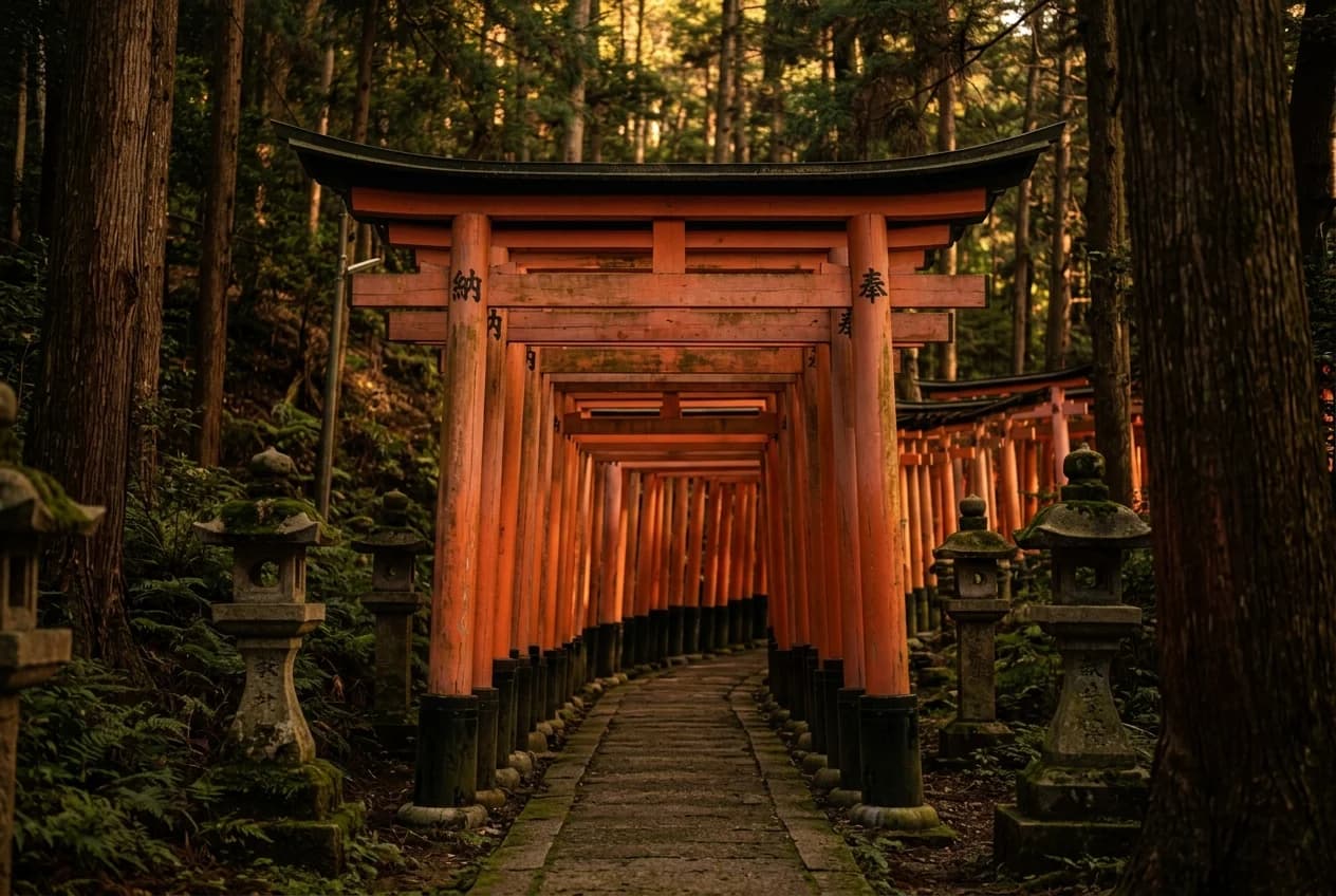
There's a second thing the grid was hiding, and I only saw it when I looked at Nano Banana Pro up close. The style anchor pulled NB Pro's mood into editorial warmth completely, despite the community reputation for gritty phone-camera realism. The anchor works really well on surface stuff: mood, color, lighting, composition feel. But look at NB Pro's Fushimi Inari torii pillars. The sequence behind the front gate doesn't keep the repeating gate geometry I'd expect from the real walkway. The anchor couldn't reach that deep. It could control the vibe. It couldn't fix how the model actually builds the scene.
the re-examination
I went back and looked at Imagen 4 standard one prompt at a time, trying to ignore the mood question for a minute.
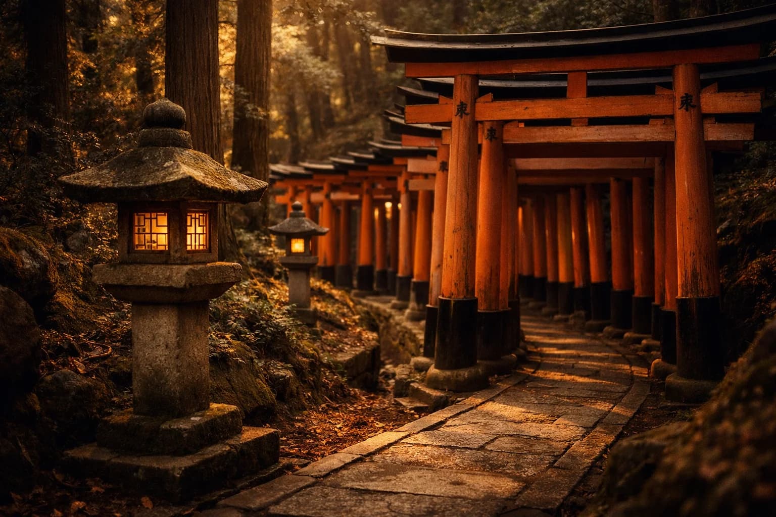
Once I forced myself to score for place accuracy, Imagen 4 standard looked different. Fushimi Inari read more like actual torii. Tsutenkaku looked closer. The trip banner stopped falling apart. Arashiyama was still slightly over-amberized, but the bamboo read as bamboo even if the path material was still wrong.
Standard wasn't perfect. But it was consistently closer to the actual place, and that was the axis I had been quietly ignoring.
That changed the recommendation. I'd been pulling toward a single default. What made more sense was matching the tier to the place where the failure would actually be visible.
what I'm taking from this
A few things changed for me after this. Match the model to the surface. Score on separate axes so a strong style layer can't drag a wrong subject along for the ride. Keep the provider abstraction thin enough that swapping takes an afternoon.
For editorial travel photography specifically, my rule now is simple:
Imagen 4 Fastfor thumbnails and high-volume cards, where the specificity gaps are invisible at 200px and the style anchor is doing most of the work.gpt-image-1-mini mediumwhen cost matters more than consistency and "close enough" is acceptable.Imagen 4 standardfor banners, heroes, and anywhere the viewer can look closely enough to notice the landmark details.Nano Banana 1as the primary failover because I already know how it behaves in production.gpt-image-1.5 mediumas secondary failover for vendor redundancy.
Underneath all of it, I still want an abstraction thin enough that when Imagen 5 ships next quarter, trying it takes a class name swap and two env vars.
what I'd test next
This was narrow on purpose: eight prompts, mostly Japan, all editorial photography, all late-day warm light. Claude helped me narrow the list, and I followed the budget. If I had more room to spend, I'd run each family more systematically — low, medium, high across the board — just to see where the real breakpoints are. A few things I'd try next.
More popular destinations. Paris, Marrakech, Istanbul, Santorini. Places where a miss would be obvious to someone who knows them. I'd expect the failure patterns to change by region.
Different art styles. This was all editorial photography. I'd want to see the same bake-off on illustration, painterly work, or postcard-style images, because some models probably lose on photography and win somewhere else.
Different times of day and seasons. Everything here was dusk or golden hour. I'd want to see what happens in harsher light, cooler light, rain, snow, or autumn, especially because Fast already pushed too warm in scenes that should have stayed greener.
when the wrong thing looked right
What bothered me was realizing that the style anchor, the thing I wrote to make the comparison fair, was also the thing throwing me off. Strong signals crowd out weak ones. And honestly? The Imagen 4 Fast images all looked good. Warm, editorial, on-mood. They'd be great thumbnails. The problem wasn't that they were bad. It was that I was about to ship them as banners, where "a different mood of the right place" quietly becomes "a confident rendering of the wrong place," and the grid wasn't going to tell me which one I was looking at.
Cost pressure made it worse, by the way. When the cheap tier was leading on mood, I wanted it to be the answer. Budget is its own kind of confirmation bias, and the honest move was to separate is this the best bang for the buck from is this actually correct, because the first question was already rooting for an answer. The image that almost shipped was gorgeous. It just wasn't the place.
FAQ
Why use a fixed style anchor across every prompt?
Because the whole point of the bake-off is to compare models on identical ground. If every prompt has its own freeform styling, you're evaluating prompt engineering, not the model. The trap is that a strong anchor can also mask failure modes on whatever axis it isn't covering.
Why did Imagen 4 Fast look like the winner at first?
It nailed the mood axis: warm palette, golden-hour light, half the price of anything else, twice as fast as Imagen 4 standard. My gut-reaction pass was tuned entirely to mood, and subject accuracy was a separate question I wasn't asking yet.
What specifically was wrong with the Fushimi Inari and Tsutenkaku images?
Fushimi Inari's torii corridor came back as a red zigzag fence lying along the path, instead of the repeated vermilion gate tunnels the shrine is known for. Tsutenkaku came back with a much slimmer, more generic tower silhouette than the real Shinsekai landmark. Both looked beautiful. Neither felt specific enough to the actual place.
Why didn't Nano Banana Pro win despite rendering well?
Cost. At thirteen to twenty-four cents per image, NB Pro is three to six times Imagen 4 standard for a quality difference that didn't matter for my use case. I was also surprised by how well the style anchor pulled NB Pro into editorial mood despite its gritty-UGC reputation, but architectural discipline was looser on close inspection (the torii pillars on Fushimi Inari go geometrically soft). The cost alone would have ruled it out regardless.
What's the general lesson for evaluating generative models?
Score on multiple independent axes that don't contaminate each other, and actively ask the question your strongest signal is suppressing. Style and subject accuracy are orthogonal, and a strong style anchor will drag subject accuracy across the finish line of any gut-reaction score unless you deliberately separate them.
Why is Nano Banana 1 the primary failover instead of Nano Banana 2?
Nano Banana 1 is already my production default, so I know its capabilities cold. On a failover path that fires maybe one percent of the time, a known-quantity model matters more than peak quality. NB1 is also seventy percent cheaper than NB2 with no measurable quality loss on my prompts.